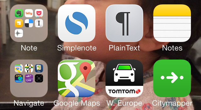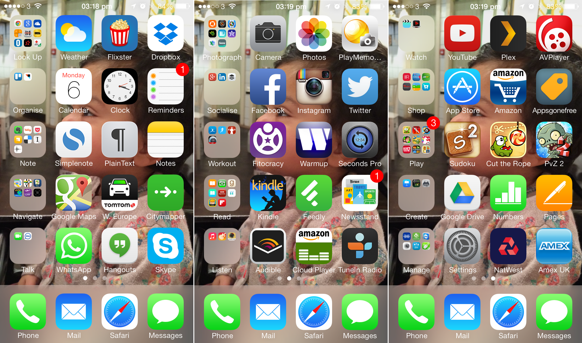
Folders in iOS are a great way to keep your large collection of iOS apps organised, but this has number of issues. Recently I starting organising my apps using an action per row approach and found it to be more efficient over iOS' default category-based naming system when it comes to launching apps.
Issues with folders:
- Requires you to tap multiple times to open an app, sometimes going through multiple folders to find an app, worse if you can't recall where you put it.
- Need to remember what folder you put an app in. I keep getting brain farts where I am staring at my screen not remembering the app or folder I’m looking for.
- Some categories e.g. Lifestyle can be a bit vague.
- Hides away the attractive icons.
You could just search, but that requires you to tap away even more and remember the name of the app. You could put the most used apps outside folders, maybe on the home screen. I find this messy and can be a bit confusing when you click on fitness and not find a app.
Verb based interfaces
Gina Trapani blogged about it a few years ago. Essentially verb based interfaces are usually more user friendly as they require less thinking, our brains think in actions more easily.
I've taken Gina's idea one step further, with action rows.

Action rows allow me to have 3 of my most used apps easily accessible alongside an action folder. You can then sort the rows based on popularity or similarity. I've ended up with a hybrid where my first screen is mostly full of productivity apps.
What's nice about this approach is that the folder acts as a sort of heading. As I use my phone mainly right handed, I keep the apps on the right, which makes them more accessible. Some prefer folders on the right.
Try and think of the actions that usually go through your mind when you use your phone. It takes a bit of time tweaking and some apps will be hard to categorise, but once you get accustomed to it, it becomes a lot easier to recall and launch applications.